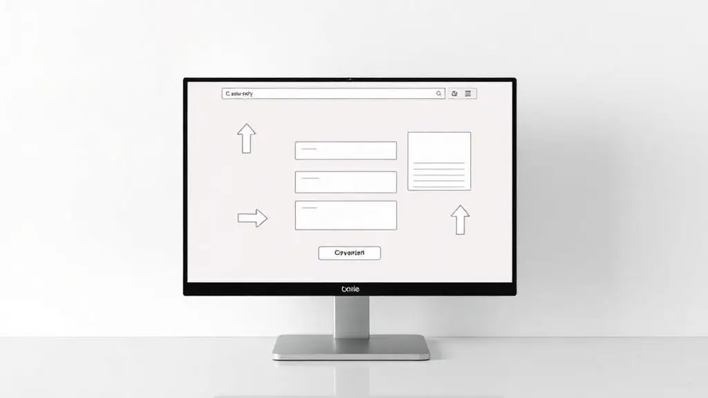
Website Design That Converts: 10 Principles Every Business Owner Should Know
Your website isn't a brochure — it's your most important salesperson. It works 24/7, handles unlimited conversations simultaneously, and never calls in sick. But only if it's designed to convert. Here are 10 principles that separate websites that generate leads from websites that just look pretty.
1. Clear Value Proposition Above the Fold
Visitors decide whether to stay or leave within 3 seconds. Your headline must immediately communicate what you do, who you do it for, and why they should care. No jargon, no cleverness — just clarity.
2. One Primary Call to Action per Page
Every page should have one primary action you want visitors to take. Too many options create decision paralysis. Make your primary CTA visually dominant and repeat it throughout the page.
3. Social Proof Everywhere
Testimonials, case studies, client logos, review scores, and certifications build trust. Place social proof near your calls to action — it's the final nudge many visitors need to take action.
4. Mobile-First Design
Over 60% of web traffic comes from mobile devices. Design for mobile first, then scale up for desktop. This means large tap targets, readable font sizes, fast loading, and thumb-friendly navigation.
5. Speed Is a Feature
Every second of load time reduces conversions by 7%. Optimize images, minimize code, use a CDN, and choose reliable hosting. Google PageSpeed Insights should score 90+ on both mobile and desktop.
6. Strategic Use of White Space
Cluttered designs overwhelm visitors and reduce comprehension. Use generous white space to guide the eye, create visual hierarchy, and make your content easier to scan and digest.
7. Benefit-Driven Copy
Write for your visitor, not about yourself. Instead of 'We have 20 years of experience,' say 'Get expert results from a team that's done this 1,000+ times.' Focus on outcomes, not credentials.
8. Trust Signals on Every Page
SSL certificates, privacy policies, BBB badges, industry certifications, and secure payment icons reduce friction and build confidence — especially on contact forms and checkout pages.
9. Clear Navigation
If visitors can't find what they're looking for in 2 clicks, they'll leave. Keep your main navigation to 5-7 items. Use descriptive labels (not clever names). Include a search function for content-heavy sites.
10. Continuous Testing
The best websites are never 'done.' A/B test headlines, CTA buttons, form lengths, images, and page layouts. Small, data-driven improvements compound over time into significant conversion gains.
Your website should be your best employee. Let's make it one.
Abbey Smith
Founder & CEO, Siren Song Marketing Group